CSS 常用布局
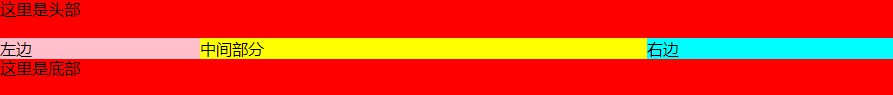
圣杯布局
即左右宽度固定,中间宽度自适应的布局。
flex 布局
核心思路:
css
/* container 设为flex布局,自适应部分给个flex: 1,左右给个宽度 */
/* 左中右 */
.container {
  display: flex;
}
.left {
  background-color: antiquewhite;
  width: 200px;
}
.middle {
  background-color: cadetblue;
  flex: 1;
}
.right {
  width: 200px;
  background-color: brown;
}
完整代码
html
<!DOCTYPE html>
<html lang="en">
  <head>
    <meta charset="UTF-8" />
    <meta http-equiv="X-UA-Compatible" content="IE=edge" />
    <meta name="viewport" content="width=device-width, initial-scale=1.0" />
    <title>Document</title>
    <style>
      .header,
      .footer {
        height: 50px;
        width: 100%;
        background-color: cornflowerblue;
      }
      .container {
        display: flex;
      }
      .left {
        background-color: antiquewhite;
        width: 200px;
      }
      .middle {
        background-color: cadetblue;
        flex: 1;
      }
      .right {
        width: 200px;
        background-color: brown;
      }
    </style>
  </head>
  <body>
    <div class="header">header</div>
    <div class="container">
      <div class="left">left</div>
      <div class="middle">middle</div>
      <div class="right">right</div>
    </div>
    <div class="footer">footer</div>
  </body>
</html>
float 布局
核心思路
css
/* 左右中,左右设置左右浮动, 容器设置 overflow: hidden 形成BFC 清除浮动 */
.header,
.footer {
  height: 50px;
  width: 100%;
  background-color: cornflowerblue;
}
.container {
  overflow: hidden;
}
.left {
  float: left;
  background-color: antiquewhite;
  width: 200px;
}
.right {
  float: right;
  width: 200px;
  background-color: brown;
}
.middle {
  background-color: cadetblue;
}
完整代码
html
<!DOCTYPE html>
<html lang="en">
<head>
<meta charset="UTF-8" />
<meta http-equiv="X-UA-Compatible" content="IE=edge" />
<meta name="viewport" content="width=device-width, initial-scale=1.0" />
<title>Document</title>
<style>
.header,
.footer {
height: 50px;
width: 100%;
background-color: cornflowerblue;
}
.container {
overflow: hidden;
}
.left {
float: left;
background-color: antiquewhite;
width: 200px;
}
.right {
float: right;
width: 200px;
background-color: brown;
}
.middle {
background-color: cadetblue;
}
</style>
</head>
<body>
<div class="header">header</div>
<div class="container">
<div class="left">left</div>
<div class="right">right</div>
<div class="middle">middle</div>
</div>
<div class="footer">footer</div>
</body>
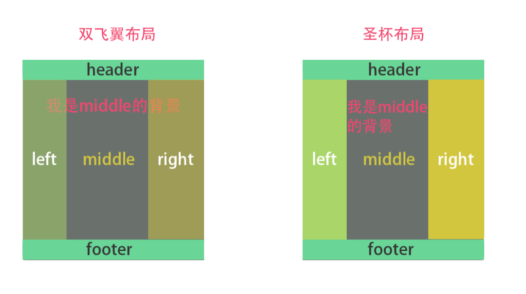
</html>双飞翼布局
双飞翼布局和圣杯布局很类似,不过是在 middle 的 div 里又插入一个 div。
通过调整内部 div 的 margin 值,实现中间栏自适应,内容写到内部 div 中。
float 布局
核心代码
css
/* 中(含inner)左右,全部设置左浮动,容器设置 overflow: hidden 清除浮动 */
/* 左盒子设置 margin-left: -100%, 右盒子设置 margin-left:-rightWidth */
/* inner 设置左右边距为 leftWidth,rightWidth,因为会给left|right 挡住 */
.container {
  overflow: hidden;
}
.left,
.right,
.middle {
  float: left;
}
.middle {
  width: 100%;
  background-color: cadetblue;
}
.middle .inner {
  margin: 0 200px;
}
.left {
  margin-left: -100%;
  background-color: antiquewhite;
  width: 200px;
}
.right {
  margin-left: -200px;
  width: 200px;
  background-color: brown;
}
完整代码
html
<!DOCTYPE html>
<html lang="en">
  <head>
    <meta charset="UTF-8" />
    <meta http-equiv="X-UA-Compatible" content="IE=edge" />
    <meta name="viewport" content="width=device-width, initial-scale=1.0" />
    <title>Document</title>
    <style>
      .header,
      .footer {
        height: 50px;
        width: 100%;
        background-color: cornflowerblue;
      }
      .container {
        overflow: hidden;
      }
      .left,
      .right,
      .middle {
        float: left;
      }
      .left {
        margin-left: -100%;
        background-color: antiquewhite;
        width: 200px;
      }
      .right {
        margin-left: -200px;
        width: 200px;
        background-color: brown;
      }
      .middle {
        width: 100%;
        background-color: cadetblue;
      }
      .middle .inner {
        margin: 0 200px;
      }
    </style>
  </head>
  <body>
    <div class="header">header</div>
    <div class="container">
      <div class="middle">
        <div class="inner">inner</div>
      </div>
      <div class="left">left</div>
      <div class="right">right</div>
    </div>
    <div class="footer">footer</div>
  </body>
</html>
双飞翼布局和圣杯布局区别
品字布局
真正的品字
- 三块高宽是确定的;
- 上面那块用 margin: 0 auto;居中;
- 下面两块用 float 或者 inline-block 不换行;
- 用 margin 调整位置使他们居中
css
body {
  overflow: hidden;
}
div {
  height: 200px;
  width: 200px;
}
.pin-1 {
  margin: 0 auto;
  background-color: cadetblue;
}
.pin-2 {
  float: left;
  background-color: antiquewhite;
  margin-left: calc(50% - 200px);
}
.pin-3 {
  float: left;
  background-color: brown;
}
完整代码:
html
<!DOCTYPE html>
<html lang="en">
<head>
  <meta charset="UTF-8">
  <meta http-equiv="X-UA-Compatible" content="IE=edge">
  <meta name="viewport" content="width=device-width, initial-scale=1.0">
  <title>Document</title>
  <style>
    body {
      overflow: hidden;
    }
    div {
      height: 200px;
      width: 200px;
    }
    .pin-1 {
      margin: 0 auto;
      background-color: cadetblue;
    }
    .pin-2 {
      float: left;
      background-color: antiquewhite;
      margin-left: calc(50% - 200px);
    }
    .pin-3 {
      float: left;
      background-color: brown;
    }
  </style>
</head>
<body>
    <div class="pin-1">1</div>
    <div class="pin-2">2</div>
    <div class="pin-3">3</div>
  </div>
</body>
</html>
全屏
- 上面的宽度设置 100%,下面两个 50%
- 下面两块用 float 或者 inline-block 不换行
css
body {
  overflow: hidden;
}
div {
  height: 200px;
  width: 200px;
}
.pin-1 {
  width: 100%;
  margin: 0 auto;
  background-color: cadetblue;
}
.pin-2 {
  float: left;
  width: 50%;
  background-color: antiquewhite;
}
.pin-3 {
  float: left;
  width: 50%;
  background-color: brown;
}
完整代码
html
<!DOCTYPE html>
<html lang="en">
<head>
  <meta charset="UTF-8">
  <meta http-equiv="X-UA-Compatible" content="IE=edge">
  <meta name="viewport" content="width=device-width, initial-scale=1.0">
  <title>Document</title>
  <style>
    body {
      overflow: hidden;
    }
    div {
      height: 200px;
      width: 200px;
    }
    .pin-1 {
      width: 100%;
      margin: 0 auto;
      background-color: cadetblue;
    }
    .pin-2 {
      float: left;
      width: 50%;
      background-color: antiquewhite;
    }
    .pin-3 {
      float: left;
      width: 50%;
      background-color: brown;
    }
  </style>
</head>
<body>
    <div class="pin-1">1</div>
    <div class="pin-2">2</div>
    <div class="pin-3">3</div>
  </div>
</body>
</html>
居中布局
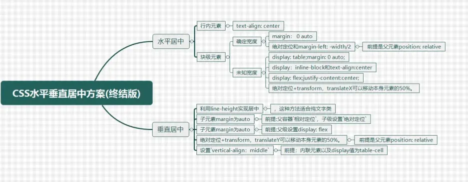
水平居中
行内元素:text-align: center
块级元素:
- 确定宽度
- width +
margin: 0 auto - 绝对定位 +
margin-left: width/2(前提是父级是 relative 定位)
- width +
- 不确定宽度
- 绝对定位 +
transformX(50%) - flex 布局 +
justify-content: center
- 绝对定位 +
垂直居中
行内元素:line-height
块级元素:
- 绝对定位 +
margin: auto(前提是父级是 relative 定位) - flex 布局 +
align-items:center